Birddy
Brand Identity | User Research | Motion Video | Birddy Collateral
Birddy is a service that helps children and families connect with nature through playful, accessible, and engaging bird related activities. I developed Birddy independently from research to concept delivery, conducting user research, creating the brand identity, prototyping the digital experience, and producing a motion video to communicate the service concept.
Research
The project began by investigating the state of biodiversity loss and the human–nature relationship. Globally, 60% of wildlife has disappeared since the 1970s, and the UK ranks 189th out of 218 countries in the WWF’s Living Planet Report (2018), one of the most nature-depleted nations in the world.
To better understand how people relate to birds, I immersed myself in the birdwatching community by attending talks, joining birding events, and observing interactions before lockdown. Speaking with birders revealed that their passion often began in childhood and that birdwatching carries strong social and emotional dimensions, yet it’s still widely perceived as an activity for older audiences.
When in-person research became limited during Covid, I conducted surveys with birders and local residents to explore perceptions of nature and accessibility. A competitor audit of existing nature-education materials revealed that most were static, text-heavy, and adult-oriented, often failing to engage families or children.
Research insights included:
-
Childhood experiences shape lasting connections with birds.
-
Birdwatching fosters curiosity and appreciation for broader ecosystems.
-
Local, accessible, and reflective activities make nature engagement more inclusive.
-
Empowerment through small, local actions encourages stewardship and community participation.
Service concept
Research insights informed the creation of Birddy, it’s a playful yet meaningful platform designed to help children and families rediscover nature through accessible, creative, and visually engaging activities that blend education, empathy, and action.
The design language needed to feel gentle, earthy, and accessible. Every aesthetic decision was guided by the goal of creating an friendly, safe and inclusive environment.
Prototyping
I drafted my concepts on paper before building the prototype on computer. I imagined how the families would be aware of the service and be engaged with the service, how they experience the service through digital and physical touch points. I then created a testing kit to send out to the invited families to test the feasibility and desirability of the concept.
I sent out the testing kit to 5 families. I learned from the feedback what works well and what does not. Here are my learnings:
- Design is clean and appealing, but too grey for children
- Service should be a combination of App/AR and traditional crafts
- A mix of indoor/outdoor and active/reflective activities can keep the entire family engaged
- Assist children with simple language and prompts to keep parents at ease
- Collaborative mapping would help to joining up resources locally
Brand identity
After the feedback I got from research, I used brighter colours for the overall visual styles and yet keeping the soft pastel tones to express calm and earthy. The bird logo symbolises care and nature, while the clean, sans-serif typography enhances readability. Motion and layout were intentionally calm and inviting, nature awaits at the doorstep to explore.
Concept video
I created a concept video introducing the service and visual identity. Using light, playful, family oriented to convey delightfulness in nature through different bird related activities. The music brings another layer to spark the playful and joyful moments in nature.
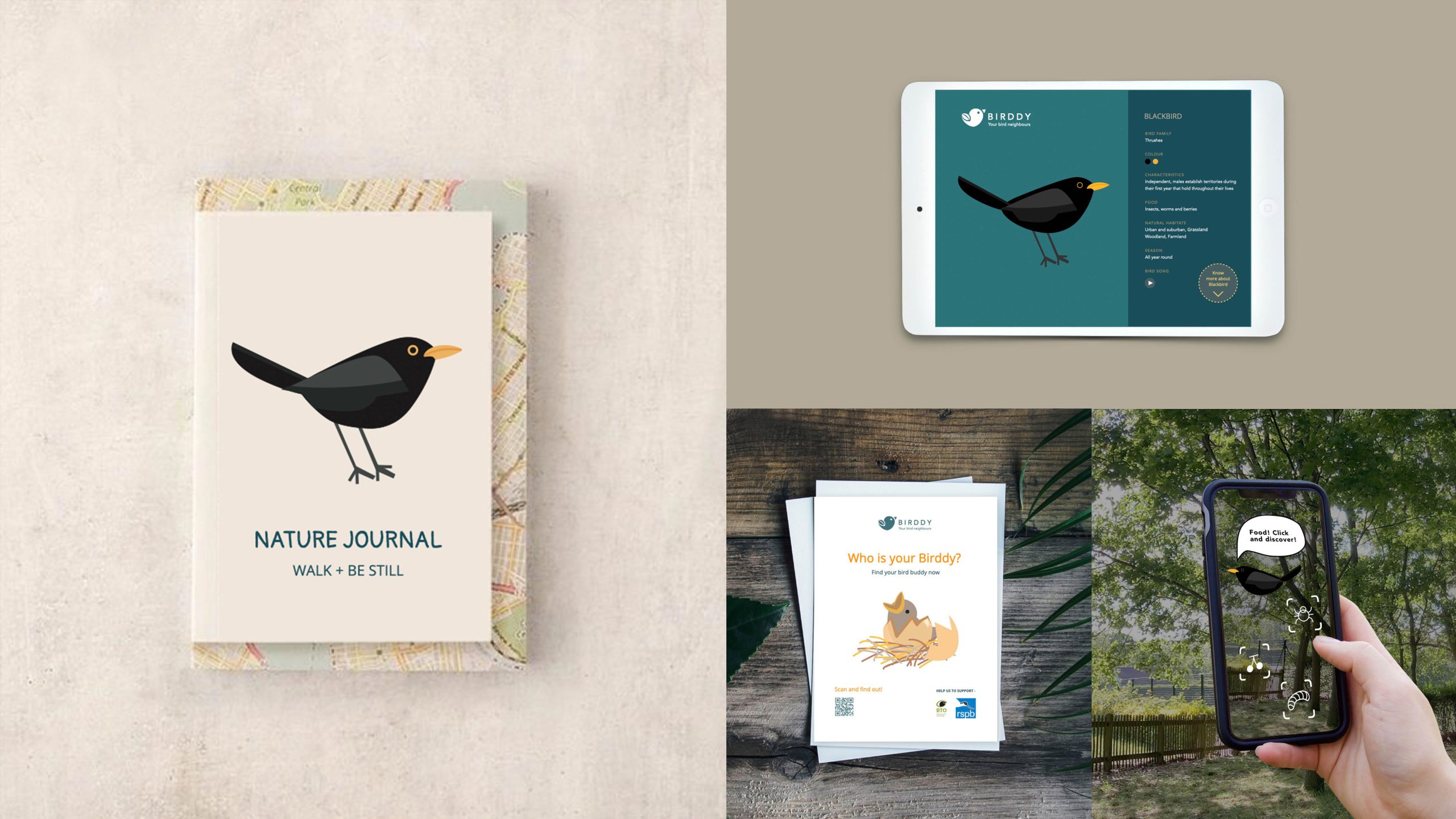
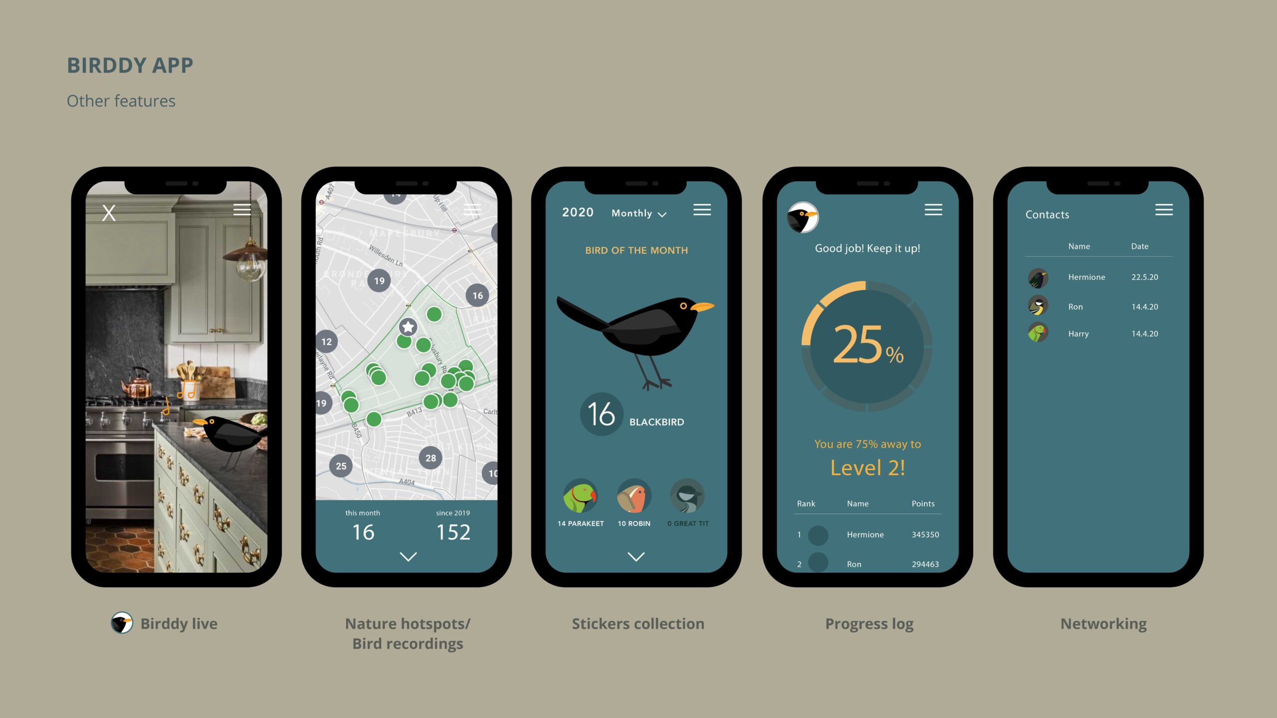
Birddy activities
Birddy’s suite of physical and digital activities helps children and families discover nature in engaging, interactive ways. A consistent visual system ties all products together, ensuring brand cohesion across every touchpoint.