The Lodge
Logo Design | Collateral Design
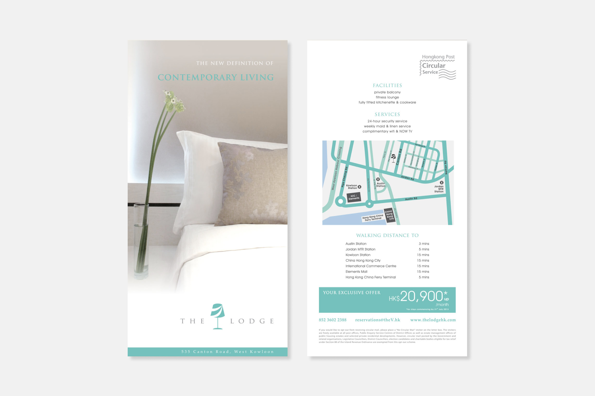
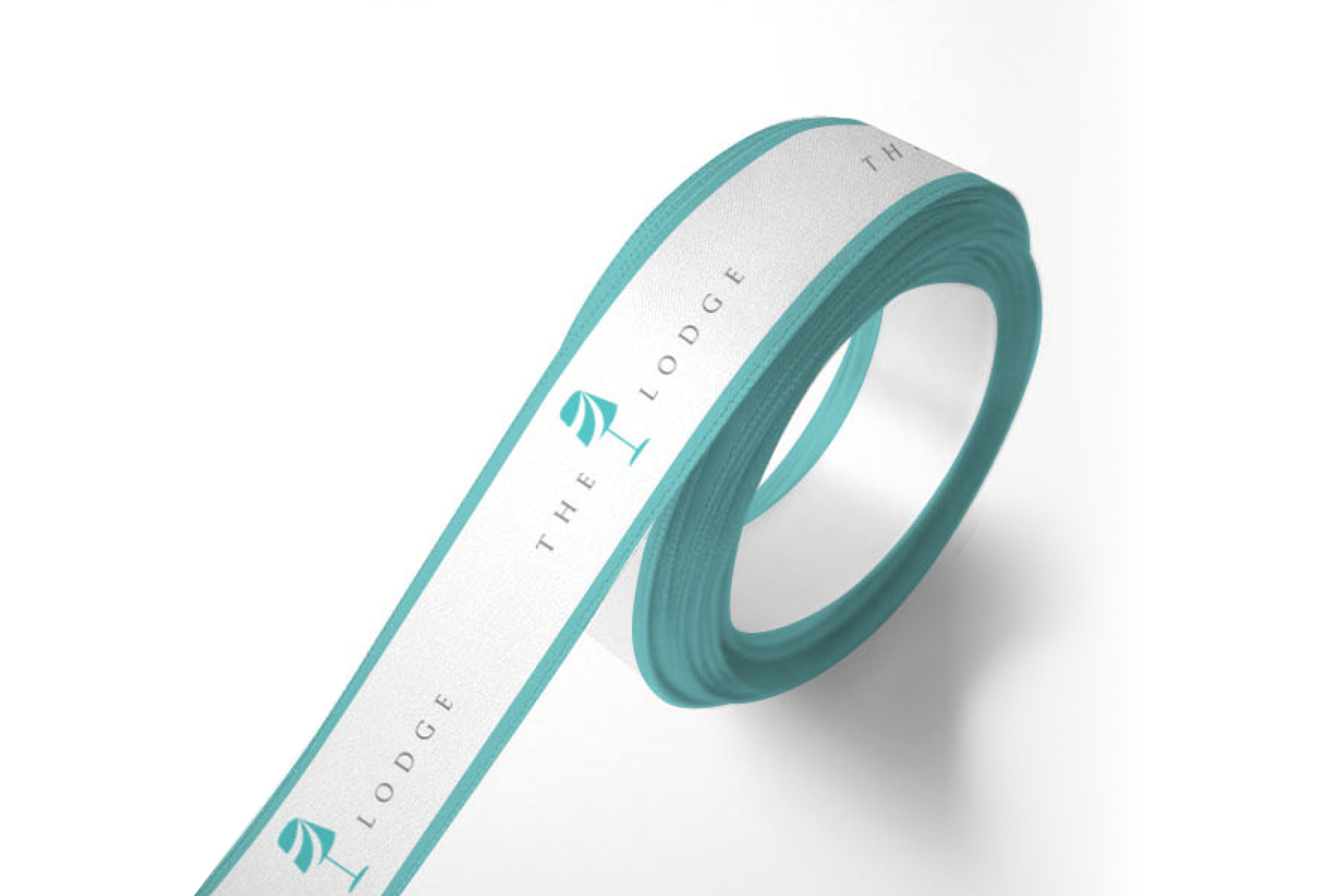
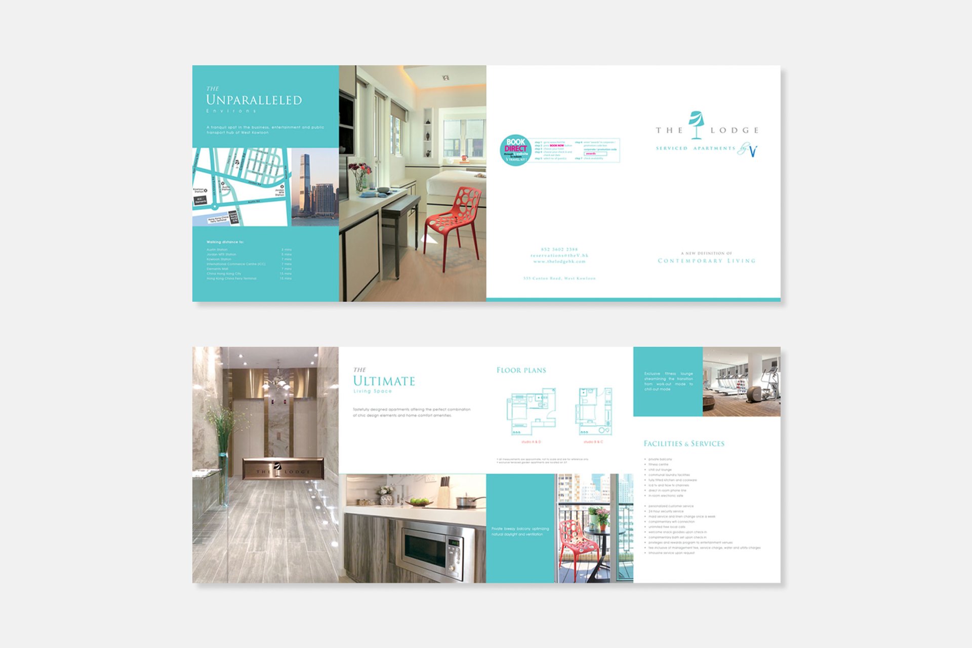
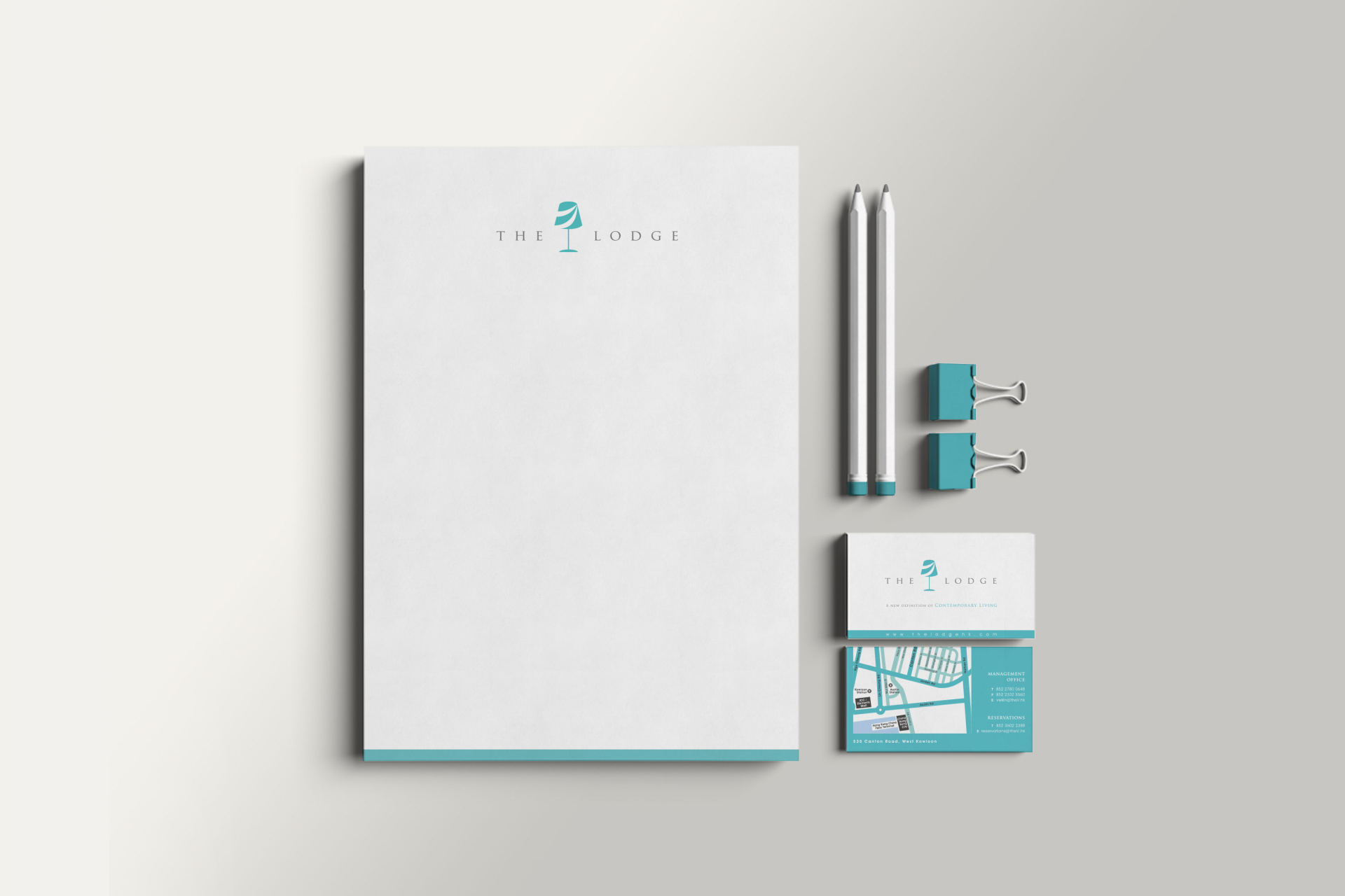
Following the 2013 renovation of The Lodge Serviced Apartments, I was tasked with developing a fresh brand identity. To evoke a sense of lightness and comfort, I selected mint as the primary color for the brand. I captured photographs of the interriors, which were then used to design various marketing materials.
![TL – logo](https://constancechung.com/wp-content/uploads/2025/01/TL-logo.jpg)
![TL – dm](https://constancechung.com/wp-content/uploads/2025/01/TL-dm.jpg)
![TL – ribbon](https://constancechung.com/wp-content/uploads/2025/01/TL-ribbon.jpg)
![TL – brochure](https://constancechung.com/wp-content/uploads/2025/01/TL-brochure.jpg)
![TL – stationary](https://constancechung.com/wp-content/uploads/2025/01/TL-stationary.jpg)